


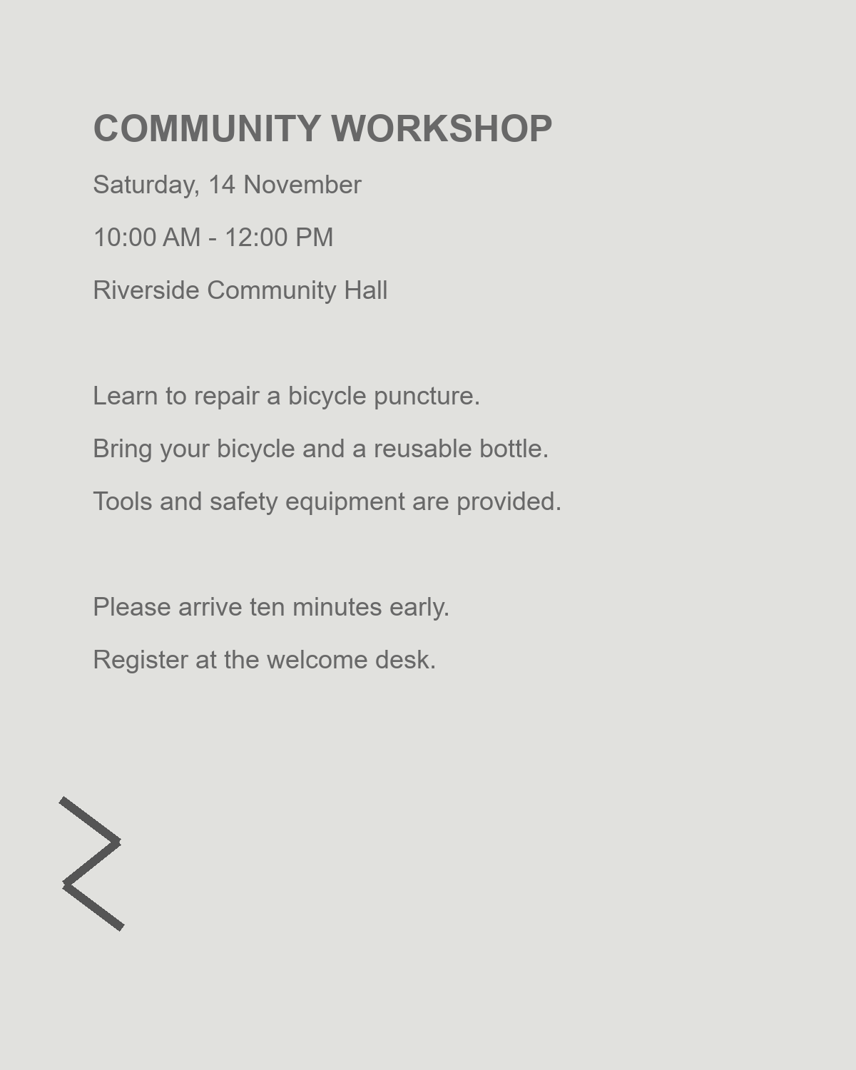
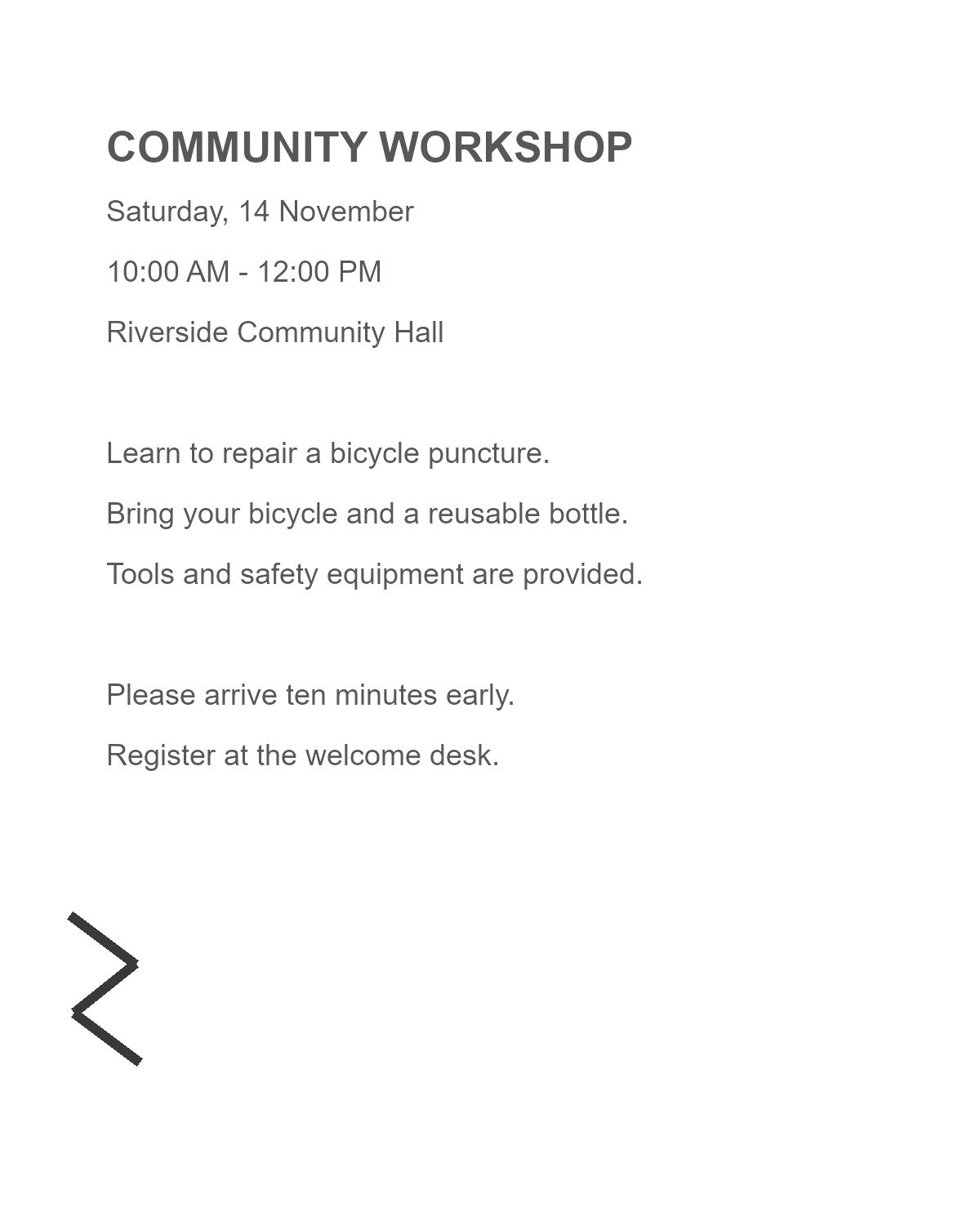

A faded scan can contain useful lettering that is difficult to distinguish from the paper. Contrast adjustments may make that separation clearer, but an aggressive setting can also remove the faintest strokes. This guide uses a light workshop notice to show a careful comparison workflow.
Open the image and identify the difficult area
Open Adjust Image Contrast and upload the original image. Supported inputs include common photo and scan formats up to 50 MB. Choose the required frame if the file contains more than one.
Before moving a slider, find a small number, a thin letter and a pale mark that must survive. These are better reference points than a heavy title, because bold print may still look clear after weaker details have disappeared.
Change one setting at a time
Increase Contrast a little and watch the reference details. The range is -50 to +50, with zero as the unchanged starting value. Reduce it again if letters become heavy or background marks become distracting.
Use Brightness when the whole image needs to become lighter or darker. It has the same range, but a different effect. Raising both settings together makes it harder to tell which change is useful, so adjust one before the other.
The example raises Contrast to 25 and leaves Brightness at zero. Use that as an illustration of a restrained change, not a preset that suits every scan.
There is no ideal contrast value for every scan. The useful setting is the one that keeps your document's information visible.
Compare with the original and use cleanup selectively
Toggle Show original to compare the source with your adjustments. Check decimal points, accents, handwritten notes and the spaces inside letters. Do not accept a cleaner-looking background if it costs useful information.
Open cleanup editor provides additional controls such as color mode, background cleanup and sharpness. Treat presets as starting points. If you clear a mark manually, make sure it is an unwanted image defect rather than a meaningful annotation.
Apply the adjustment and review the saved file
Choose PNG, JPEG or lossless WebP, then click Apply Contrast. Download the result and inspect its small text. PNG and WebP avoid lossy compression; JPEG uses its highest quality setting but still compresses lossily.
Keep the original beside the adjusted copy. If your next task is OCR, recognize the clearer source and check the resulting words against the image. A visually stronger scan is useful, but it is not proof that every word will be recognized correctly.
Image contrast questions
Should I always increase contrast before OCR?
No. A clean source may already be suitable. Compare carefully and keep the original when an adjustment removes detail or introduces noise.
Can I fix motion blur with these sliders?
No. Brightness and contrast change tonal values; they cannot recreate letter detail lost to motion blur.
Can I keep the image in color?
Yes. The ordinary brightness and contrast workflow does not require grayscale or black-and-white output.
Find a balance that keeps the detail
Make small adjustments, compare the weak characters and save the useful version.